Pantone systém – Váš průvodce světem přesných barev
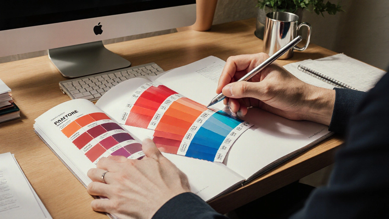
When working with Pantone systém, standardizovaný soubor barevných vzorků, který umožňuje tvůrcům přesně definovat a reprodukovat barvy napříč různými médii. Also known as Pantone Matching System, it zajišťuje konzistentní vzhled od digitálního návrhu po finální tištěný produkt. CMYK, čtyřbarevný tiskový model založený na cyan, magenta, žluté a černé and RGB, aditivní barevný prostor používaný na monitorech are often compared with Pantone, because designers need to translate Pantone swatches into these color models for production. The Pantone systém encompasses a vast library of spot colors, each identified by a unique code, which makes it easier to communicate exact hues with printers and manufacturers. It requires precise matching tools – swatch books, digital libraries or software plugins – to avoid costly mistakes in color reproduction. Moreover, Pantone influences barevná teorie, offering a palette that designers use to build harmony, contrast and branding identity.
In practice, Pantone tisk, proces, kde jsou barvy přenášeny na papír, textil nebo plast often relies on the conversion of Pantone colors to CMYK values, but the result can differ due to gamut limitations. That’s why many professionals keep a physical Pantone swatch book handy – it acts as a reference anchor when digital previews fall short. RGB, on the other hand, is essential for screen‑based work; designers create mockups in RGB and later map them to Pantone for print. The interaction between these three systems creates a workflow where Pantone serves as the common language, CMYK handles the mechanical side of printing, and RGB fuels the initial visual concept. Understanding these relationships helps avoid the classic pitfall of “barevná odchylka“ when a design moves from screen to paper.
The articles below dive into specific aspects of this ecosystem. You’ll find guides on how to convert Pantone to CMYK and RGB, tips for choosing the right Pantone swatch for branding, and explanations of how color theory supports effective palette selection. Whether you’re preparing a logo, a packaging design, or an art project, the collection gives you actionable insights to master color consistency across any medium. Explore the posts to see practical examples, step‑by‑step tutorials, and common pitfalls to watch out for, so your next project looks exactly as you envision it.
Pantone barva - co to je a jak ji využít v designu
Zjistěte, co je Pantone barva, jak funguje Pantone Matching System, jak ji převést do CMYK, RGB a HEX a jak správně používat Pantone knihy v designu.
Zobrazit víceOblíbené příspěvky


Jak nahradit malířský váleček efektivně
kvě, 30 2024